

COLOUR THEORY
MONOCHROMATIC | ACHROMATIC | ANALOGOUS | COMPLIMENTARY
Working with colour can be scary! We get it! In this blog post we will be talking about different colour harmony groups, how you can apply them to your wardrobe and everyday outfits, and achieve some eccentric looks.

Firstly, monochromatic looks. A trend that has been around for a while, and is still going strong. We see it in our everyday lives, on the runway, in our sweatsuits, or in our favorite all black outfit. “Mono” meaning “one” and “chroma” meaning “colour”. Pick a colour, any colour. You can pair varying shades of the same colour, so don’t get stuck on matching exact colours. Try mixing and matching different shades of colours with each other and see what you like best.

Here we can see some examples of monochromatic looks. Some outfits that incorporate one shade of the colour, and some that incorporate 2 or more.

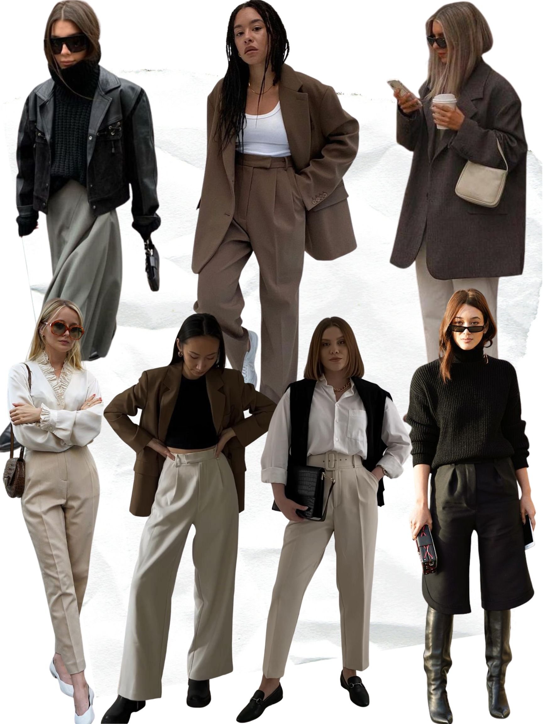
Achromatic means lack of colour. “A” meaning lack of, “chroma” meaning colour. Lack of colour. Achromatic outfits incorporate varying shades of blacks, whites, and greys. Think neutrals.

Here are some examples of achromatic outfits. Notice how there is a lack of colour, and varying shades of neutral tones.
Analogous colours are groups of colours that are adjacent to each other on the colour wheel and correspond well to each other. For example red, red-orange, and orange are analogous colours as they are beside each other. Other colours we see paired a lot are blue , blue-purple, and purple, as well as green, green-blue, and blue.

Here you will see varying shades of analogous, or corresponding colours. There are so many different variations and shades of colour to work with. If you feel as if some colours are too flashy for you, then you can stick to the basics by using darker shade variations (forest green and navy blue).

Complimentary colours are colours directly opposite each other on the colour wheel. This is also what we would call “colour blocking”. It is when we mix two or three bold, contradictory colours to create a great statement piece. Some examples of complimentary colours are red and green, blue and orange, purple and yellow, green and magenta. We see a lot of use of complimentary colours on the runway to create striking outfit combos.

Below are some examples of complimentary colours used in fashion. There is versatility in the use of complimentary colours between haute couture and ready-to-wear fashion, as there are so many different shade variations to choose from. Take a look at the colour wheel and notice how the complimentary colour to red and red-orange are very different and will create differing looks.

So you’ve made it to the end. Congrats! I hope you learned something new and are planning on incorporating some colour (or lack of) into your outfits. I know it may not come naturally to you, it sure doesn’t for me as I am a sucker for my neutrals, however when I do add that pop of colour into my outfit I always feel like a million bucks.
- Laura